

Bringing together sport, the energy of young players and local pride in a single visual style was a challenge we took on with enthusiasm. The goal was to create something modern and memorable that also respects the city's hockey tradition and the spirit of the team.
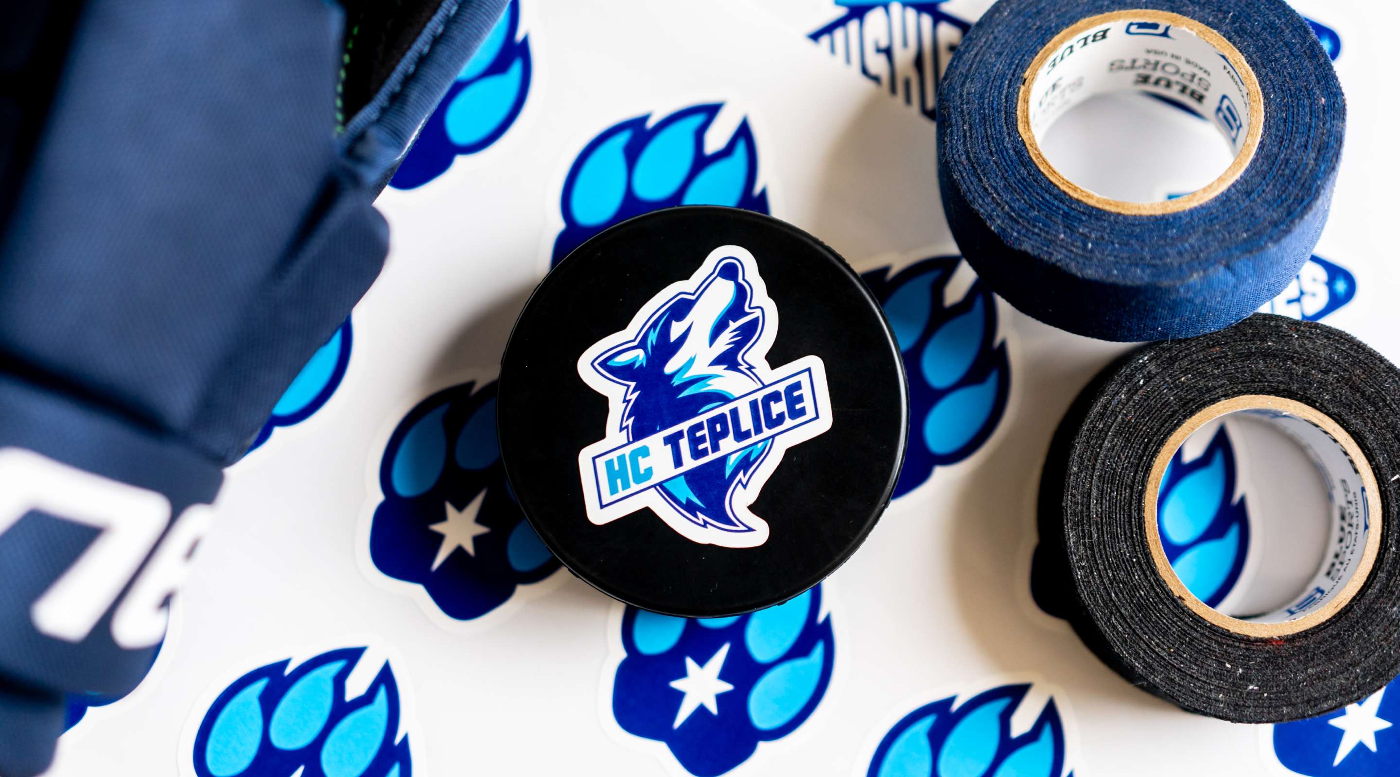
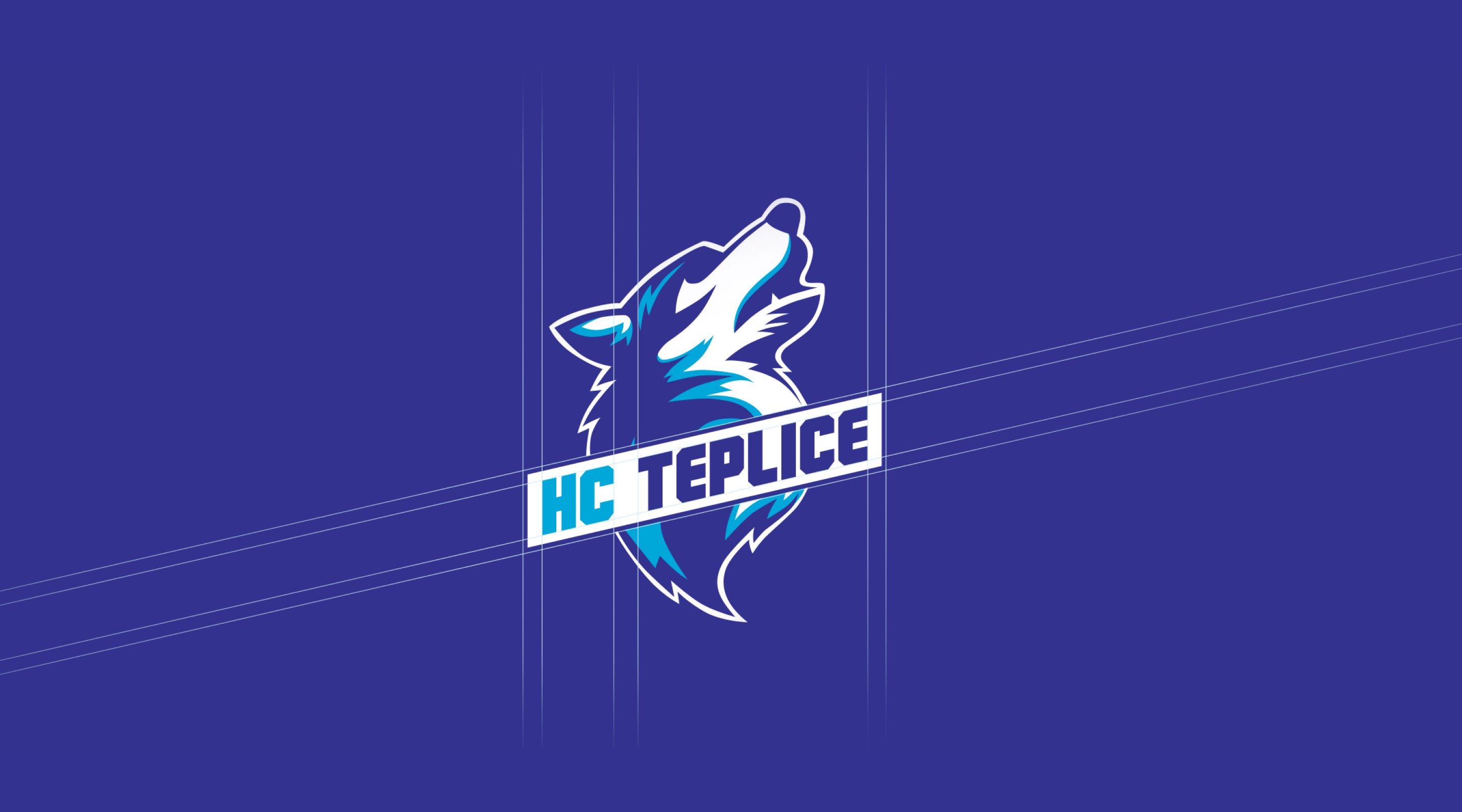
The key motif became the husky – a strong, determined Nordic dog that naturally symbolises team spirit, endurance and dynamism. We were looking for a stylisation that would be visually appealing to young players, yet bold enough to command respect in the context of hockey competition. The result is a brand that combines ferocity with playfulness – one that kids will love, parents will connect with, and that won't get lost even among the “grown-up” teams.
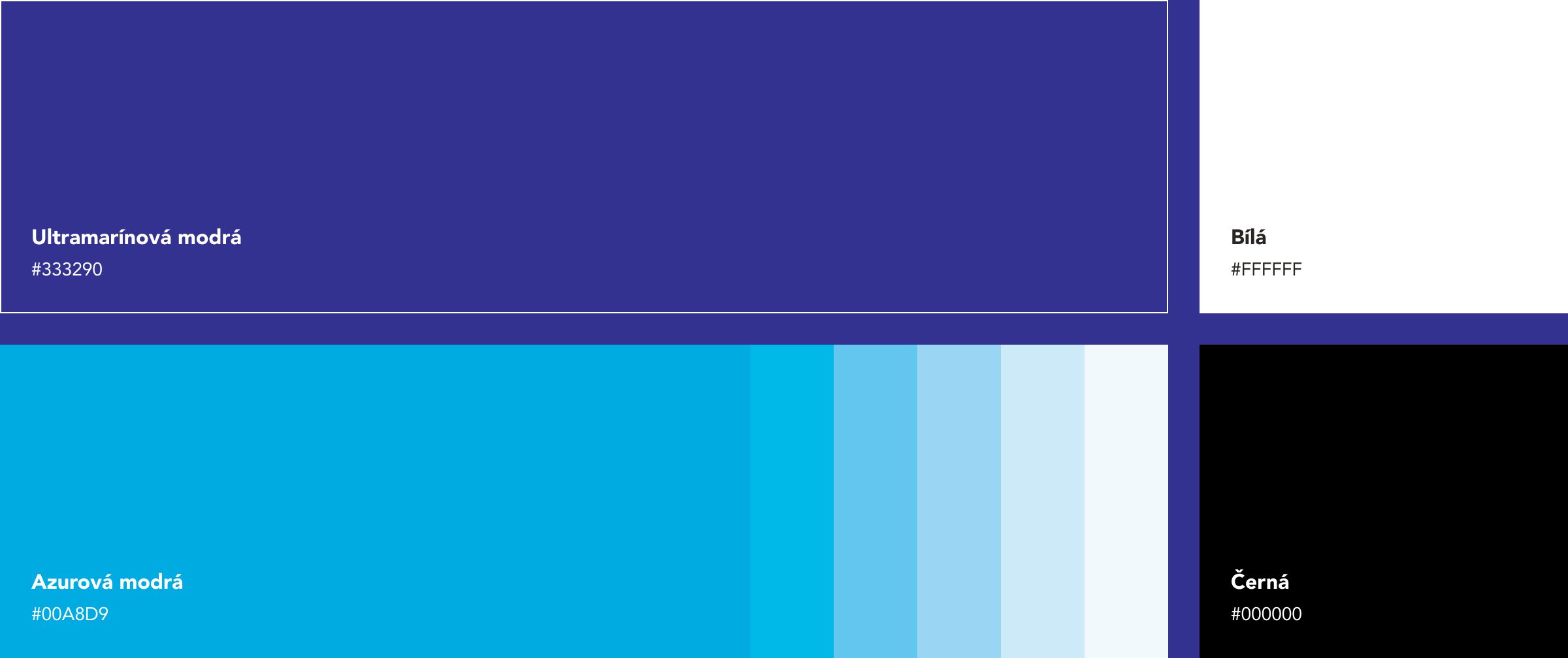
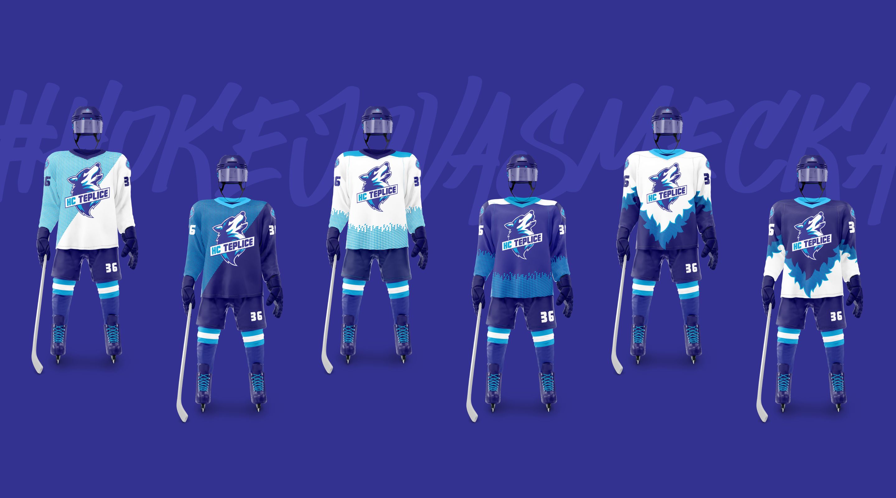
The colour palette of the visual identity is based on a combination of ultramarine blue and azure. Ultramarine brings depth, strength and stability to the brand, while azure symbolises freshness, energy and youthfulness. A key factor in choosing this colour was also the fact that azure is one of the official colours of the city of Teplice. Combining these two shades creates a visual style that is not only dynamic and modern but also firmly rooted in local identity.
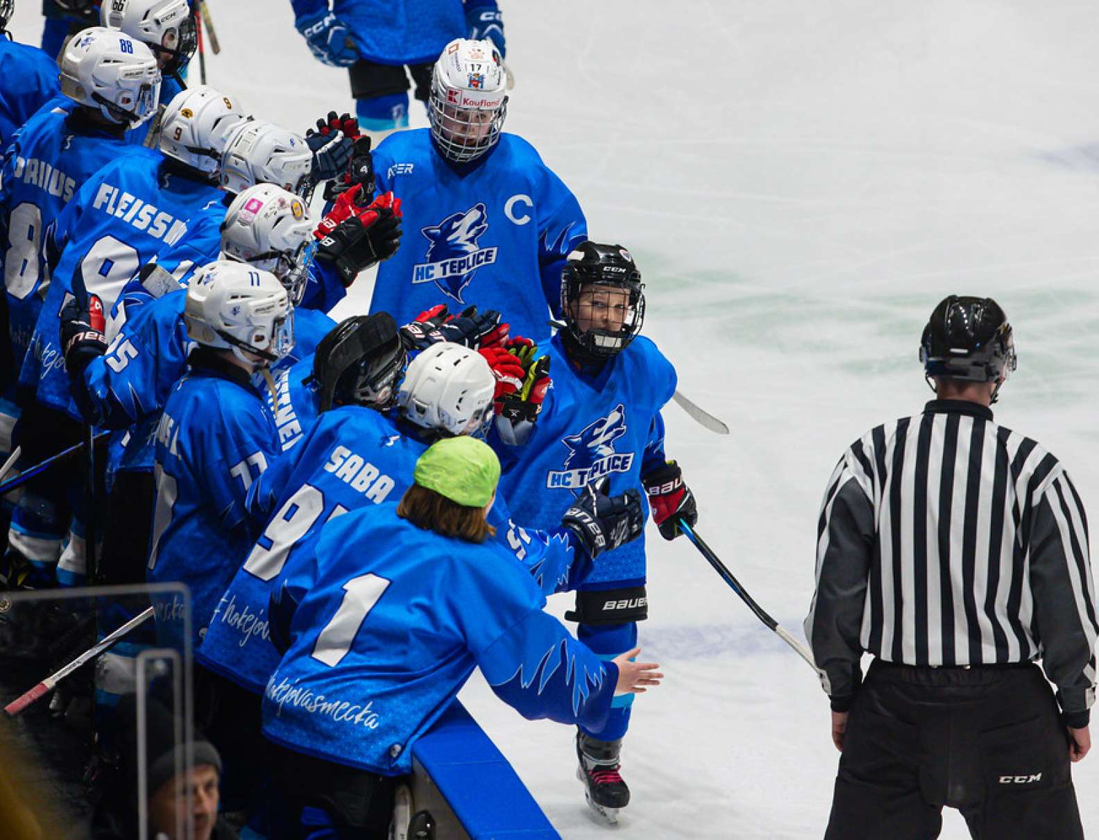
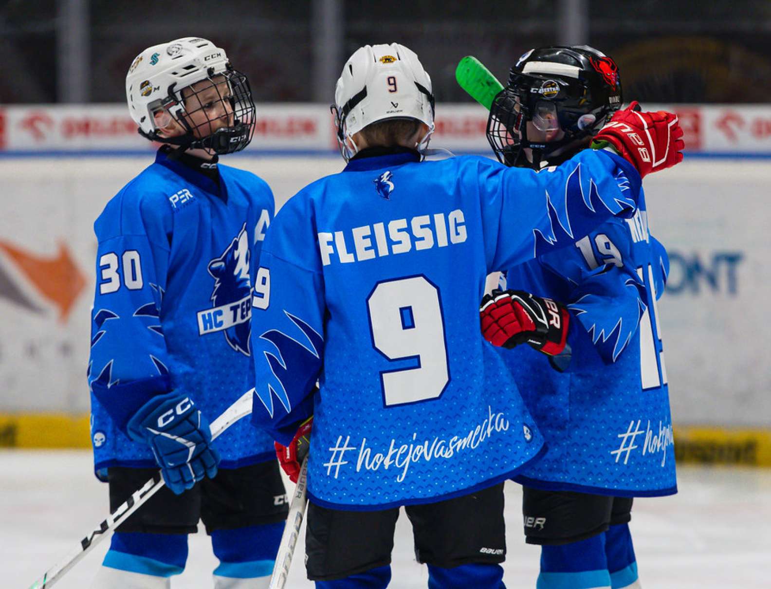
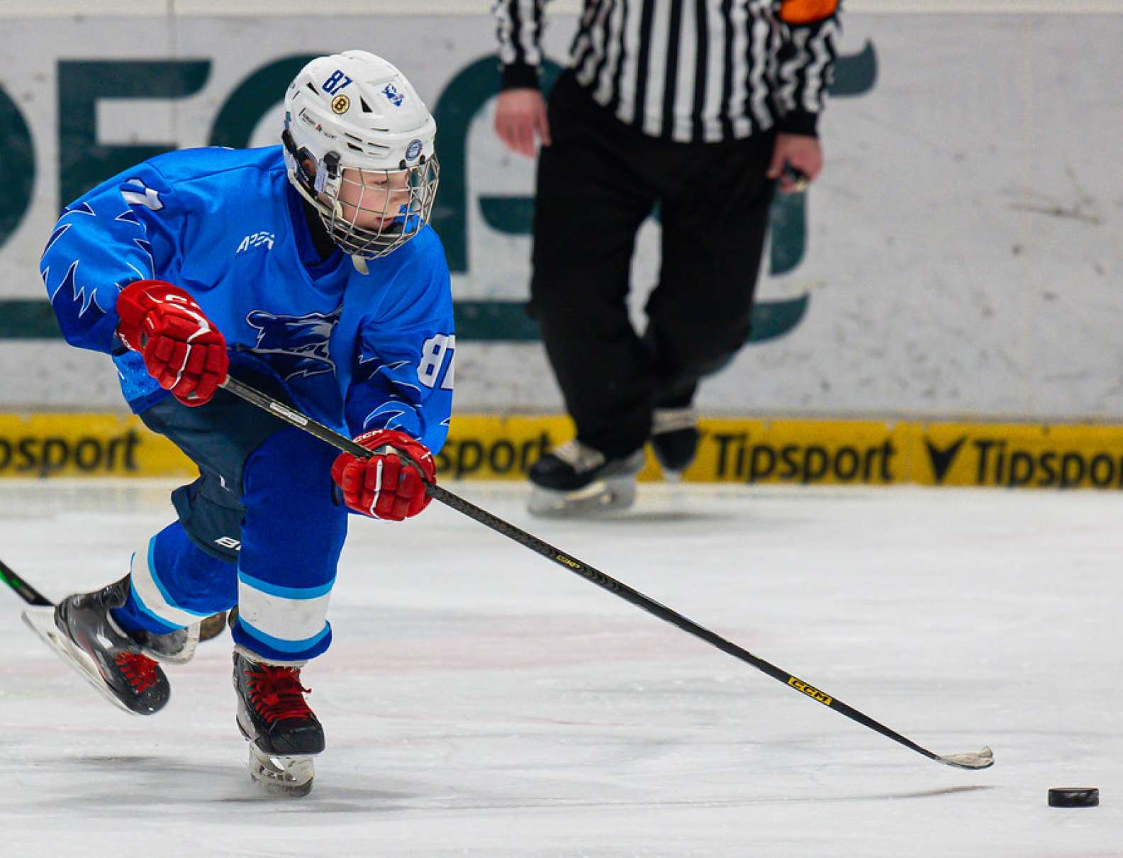
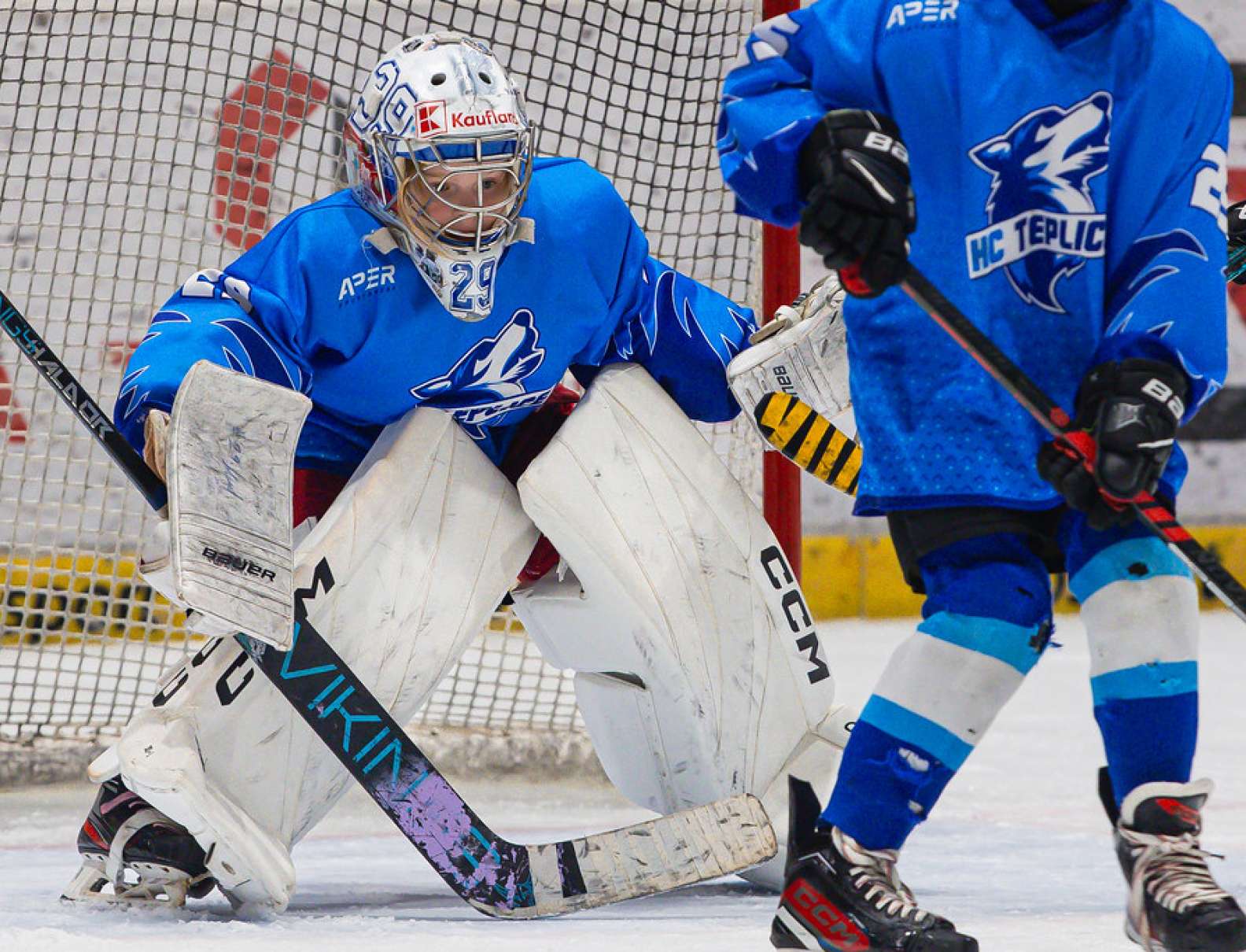
Seeing our design on the jerseys of kids who love hockey is the greatest reward for us. It was precisely this genuine energy and enthusiasm of the young athletes that made us decide to go even further – helping the team expand its visual identity and create a stronger foundation for its presentation and growth.
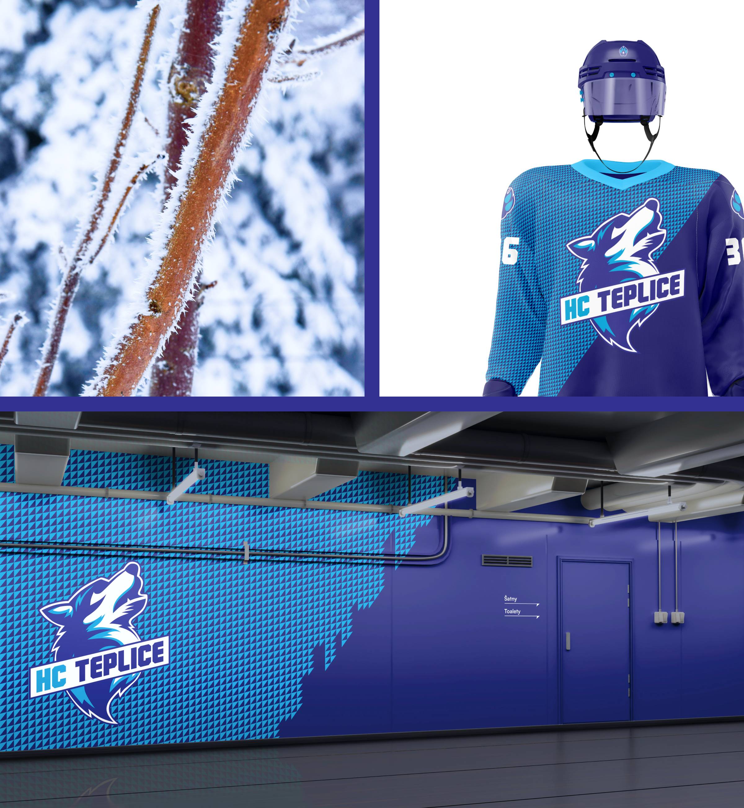
The core element of the visual style is a geometric grid of triangles reminiscent of frost crystals. The structure evokes the ice surface, the cold, and the sharpness and tension of the game. The motif feels both technical and organic – it can be used as a texture, a background or a dominant graphic element.
As the kids grow and the club adds older age groups, it was important to design a visual identity that both the youngest players and the older ones could identify with. The style had to stay playful, yet strong enough to be respected among the juniors too. That way, the brand grows together with its pack.
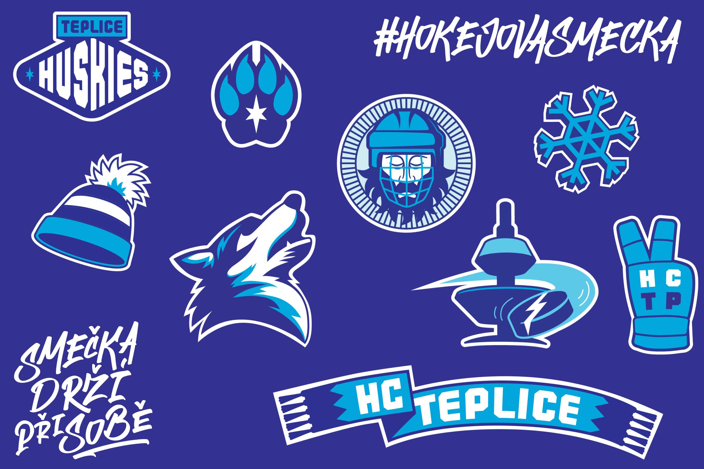
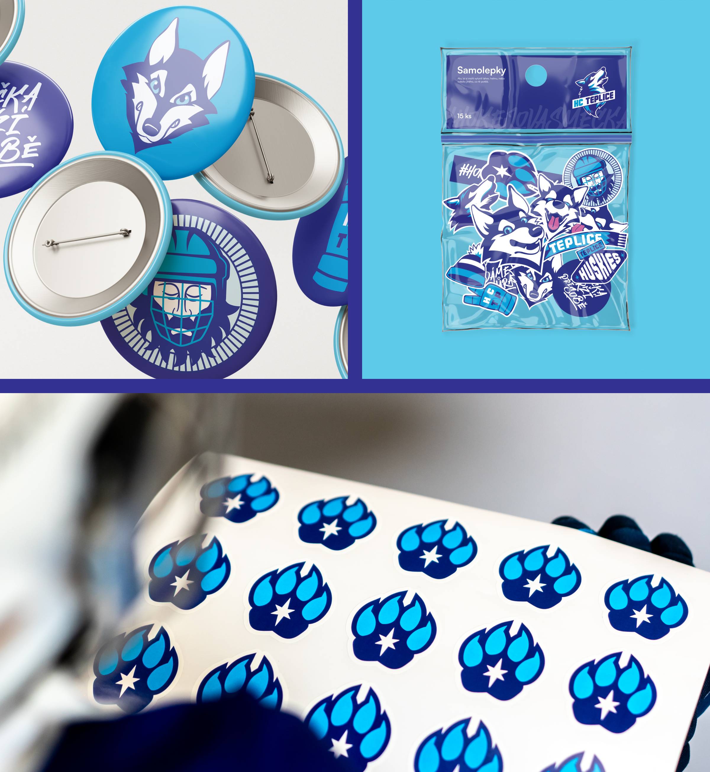
To support the club identity off the ice, we designed a series of secondary marks that extend the main logo and offer greater flexibility for merchandise. The visual identity also includes tags featuring distinctive hockey catchphrases – an ideal way to connect the visuals with everyday hockey culture and to appeal to fans and players alike. Thanks to the variety of graphic elements, the brand feels lively and modern and adapts easily to the club's everyday visual style.
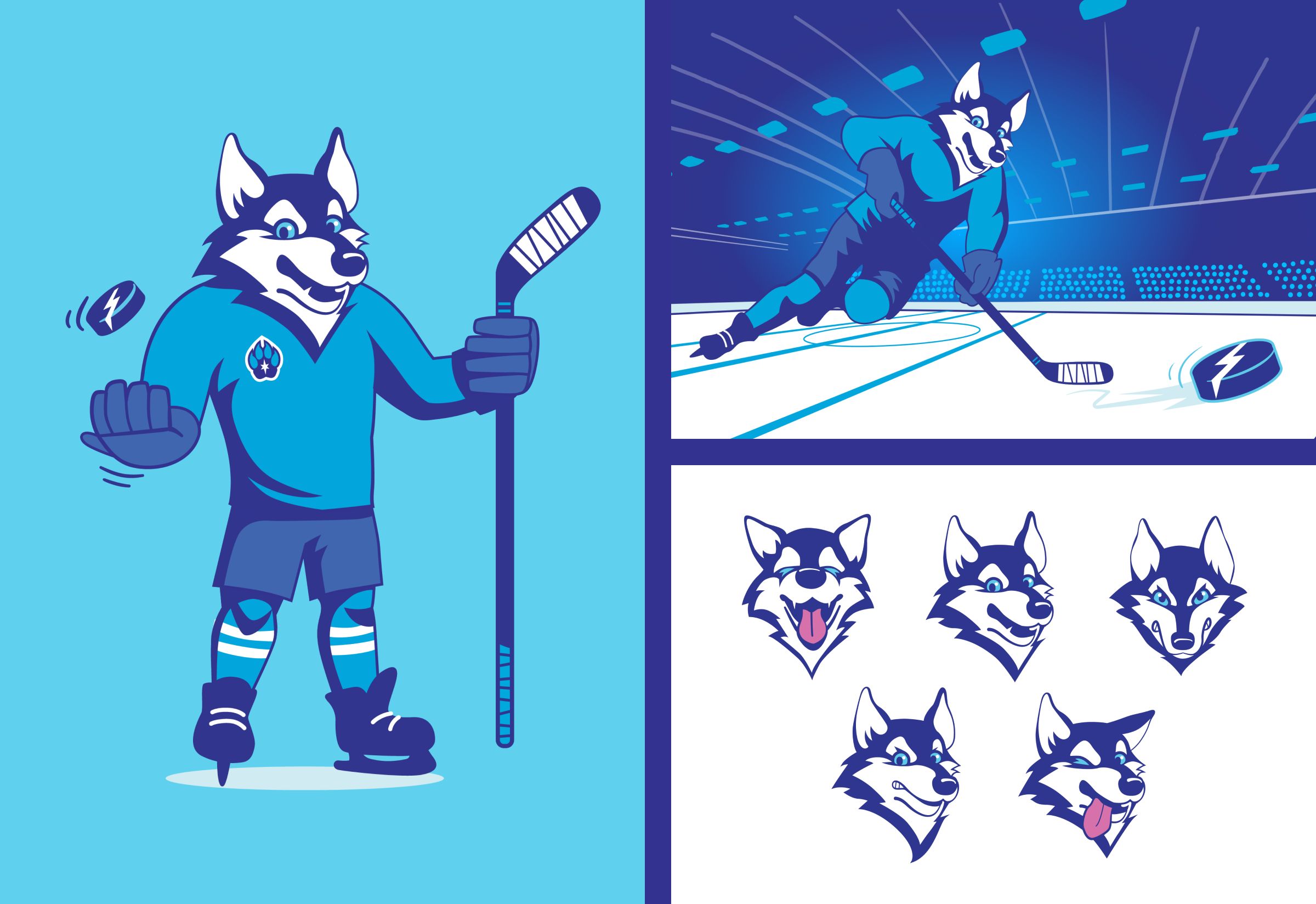
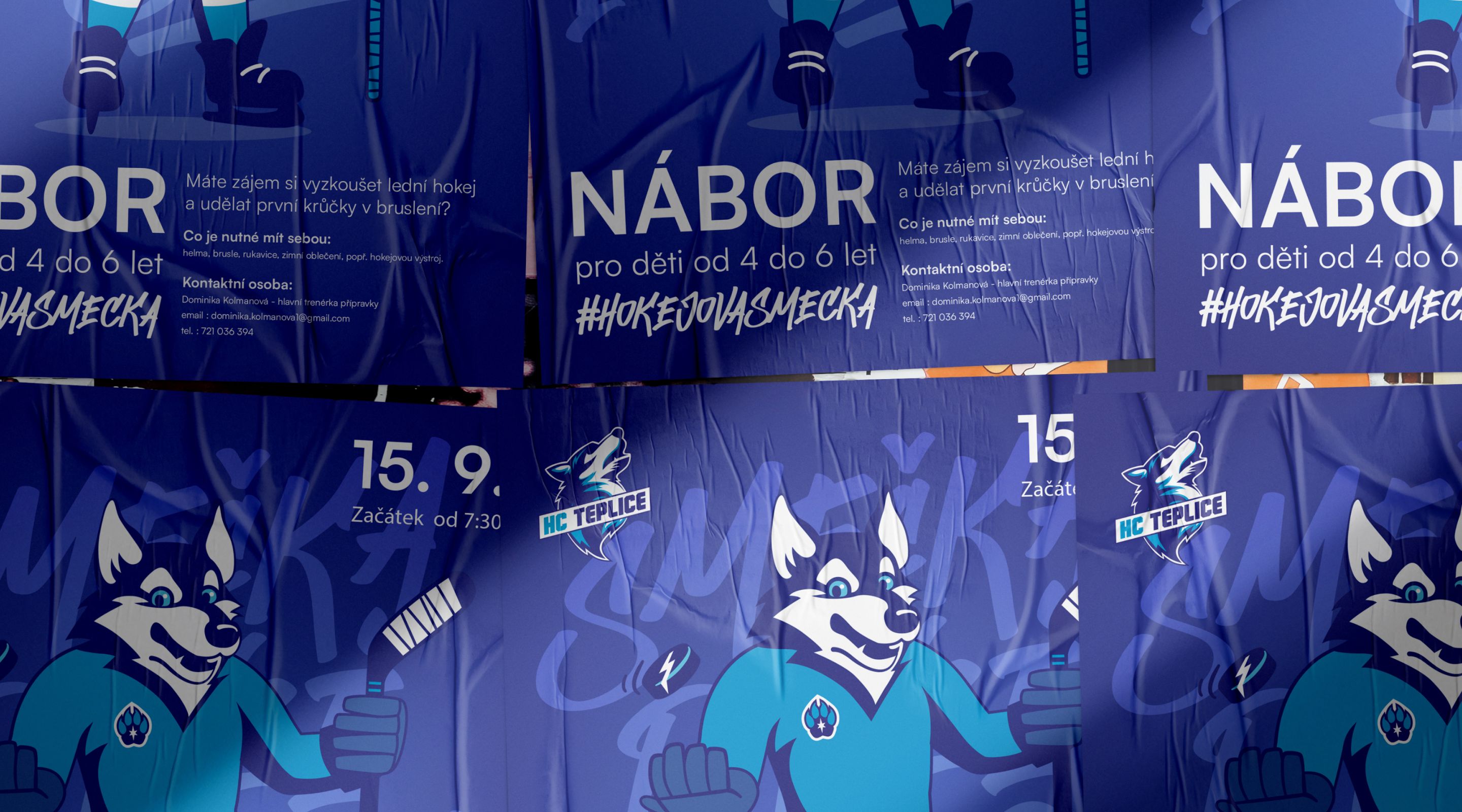
The mascot of the Teplice hockey team is a husky – a strong, tireless and friendly dog that captures both the team spirit and the wintry world of hockey. He wears a jersey and holds a hockey stick, so it's immediately clear where he belongs.
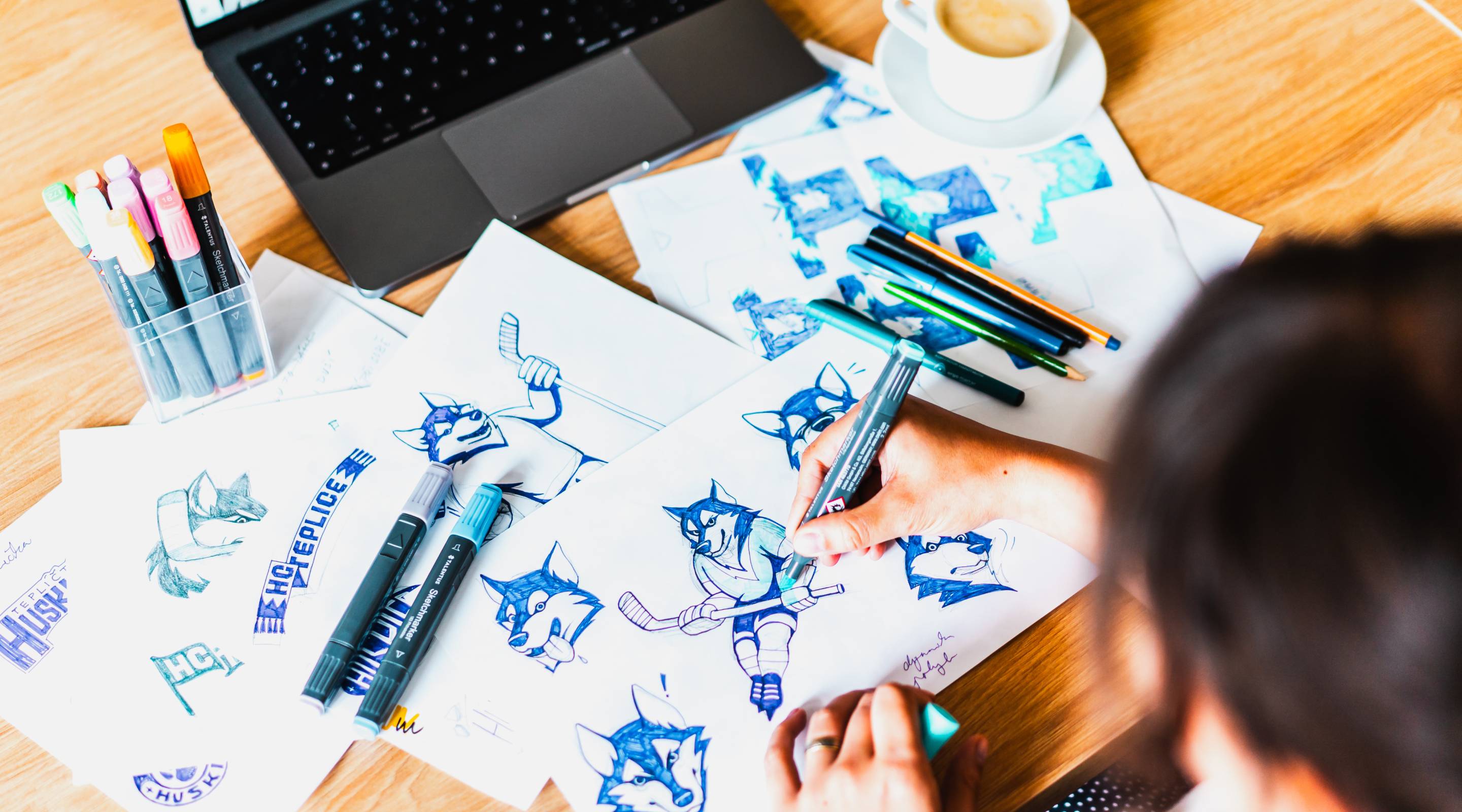
We created several different expressions that let the mascot react to various situations – joy, tension or surprise. This makes him easy to use both at the arena and in communication with fans – from posters to social media.
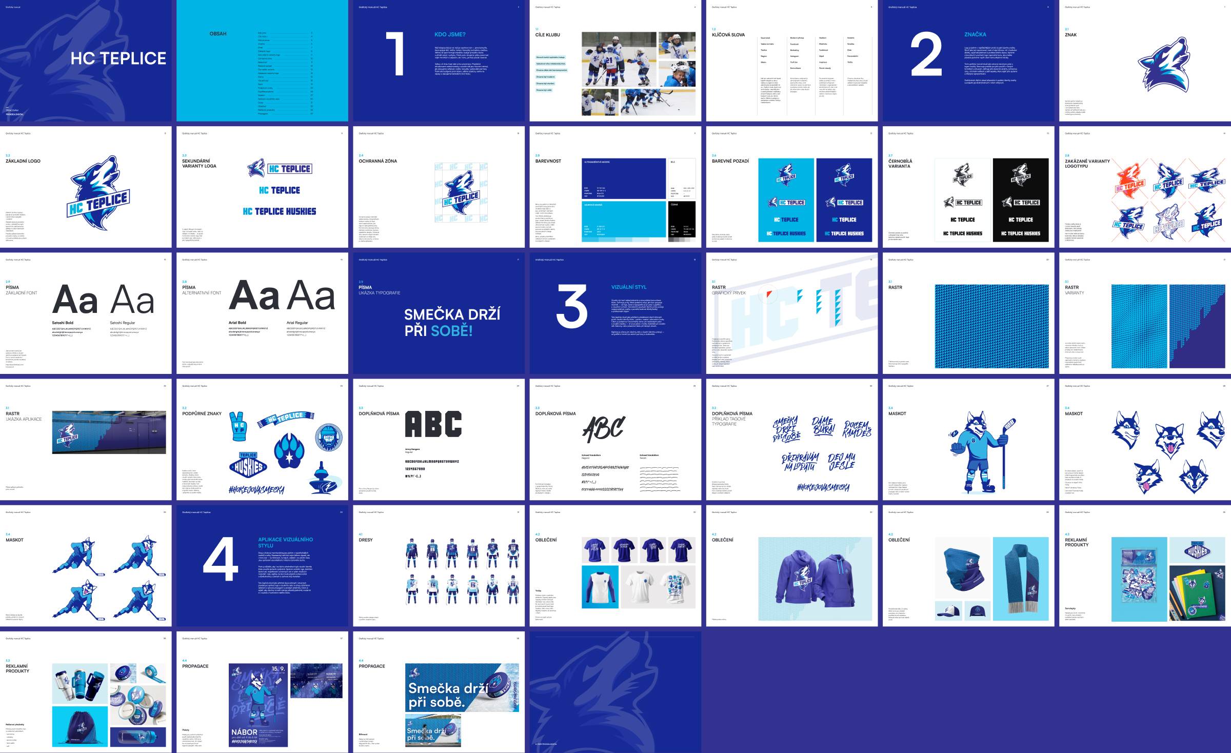
Many people work with the visual identity – from coaches and marketing to the club's partners. To keep the brand consistent across all outputs, we prepared a detailed brand manual. It sets out clear rules for using the logo, colours, typography and other visual elements, helping the brand stay strong and recognisable.
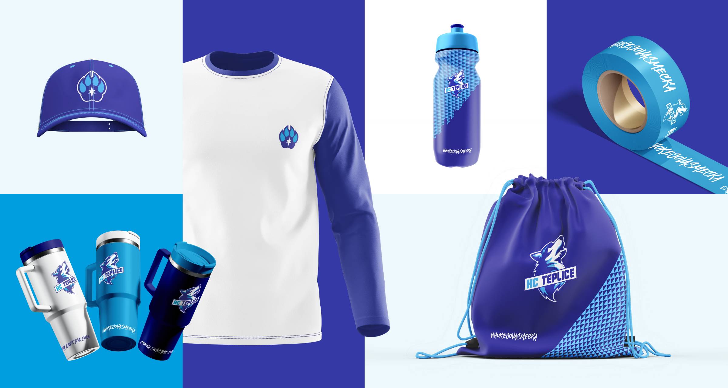
We designed a range of products divided into two main lines – functional club gear made for the players, and leisure merch for fans, parents and anyone who wants to be part of the pack. That way, everyone can find something for themselves and proudly represent the HC Teplice Huskies brand on and off the ice.
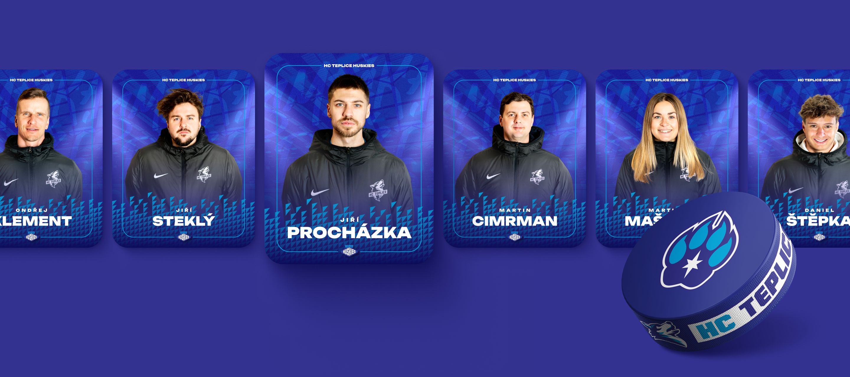
Lots of great people help run the team – coaches, assistants and other members of the support staff. An integral part of our collaboration is also production and photography, which allows us to introduce these faces. We want every player and parent to know who stands behind the team and who they can turn to at any time.
HC Teplice Huskies is a team attracting ever more interest – lots of kids turn up to the recruitment days and the club keeps on developing. That's another reason why it was important to take the visual identity to a new level. It is becoming the face of all the club's activities, from recruitment campaigns to everyday communication with parents and partners. A good club starts with a strong brand – and that's exactly what we helped create together.
We'd like to thank the HC Teplice Huskies team for the great collaboration, their trust and the enthusiasm with which we were able to create the new identity together. We look forward to taking further steps together in developing the brand and building a strong home for young hockey players and their fans.
