

Designing a logo for a travel agency is a bit like planning the perfect holiday – it has to be well thought out, memorable and, above all, make you want to set off on a journey. The final design shows a direction the Hanky travel agency’s visual identity could take, capturing its friendly, open and adventurous character.
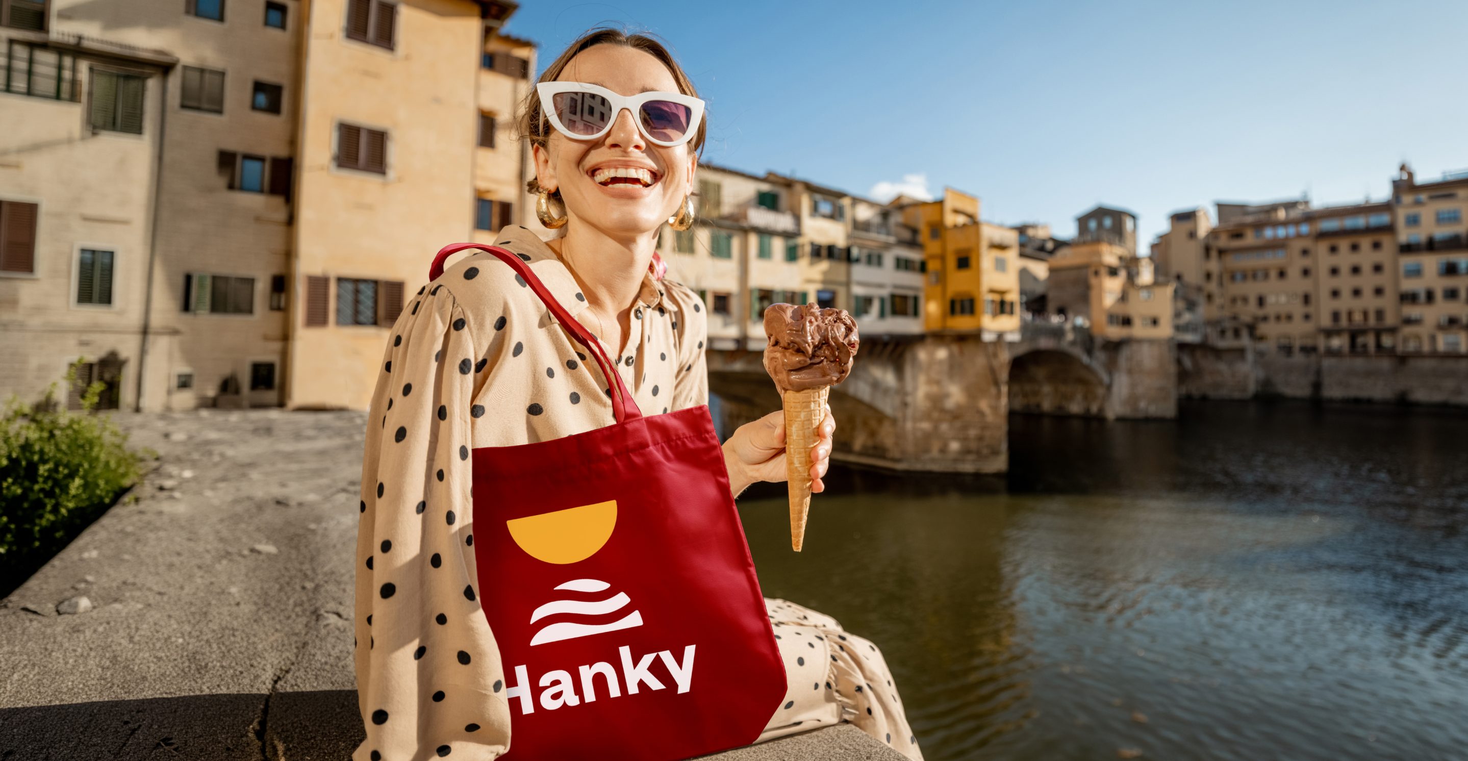
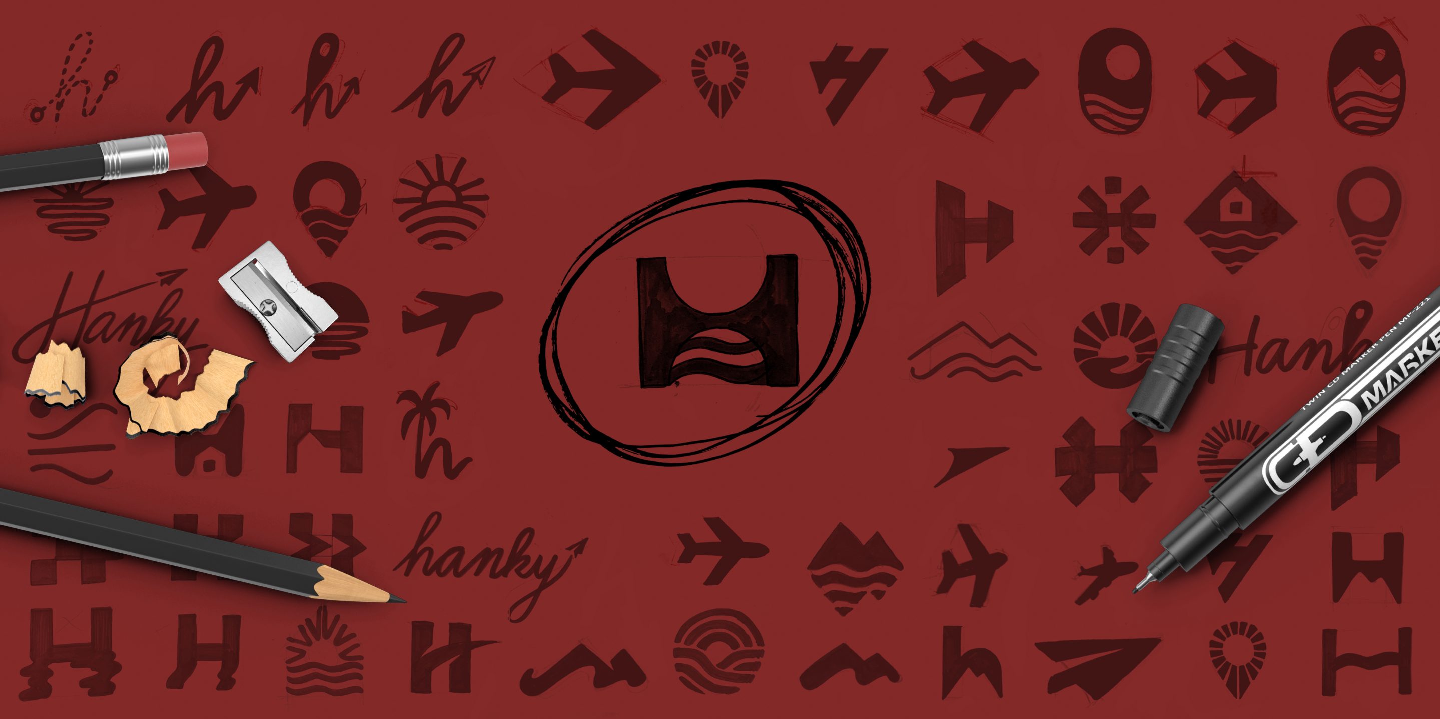
When designing the logo, we looked for a way to subtly project the atmosphere of travel into a simple shape. We therefore decided to work with the negative space in the letter H, which became the carrier of the whole design’s main idea. This work with form produced a clean, minimalist symbol that discreetly references the sun above the surface of the sea.


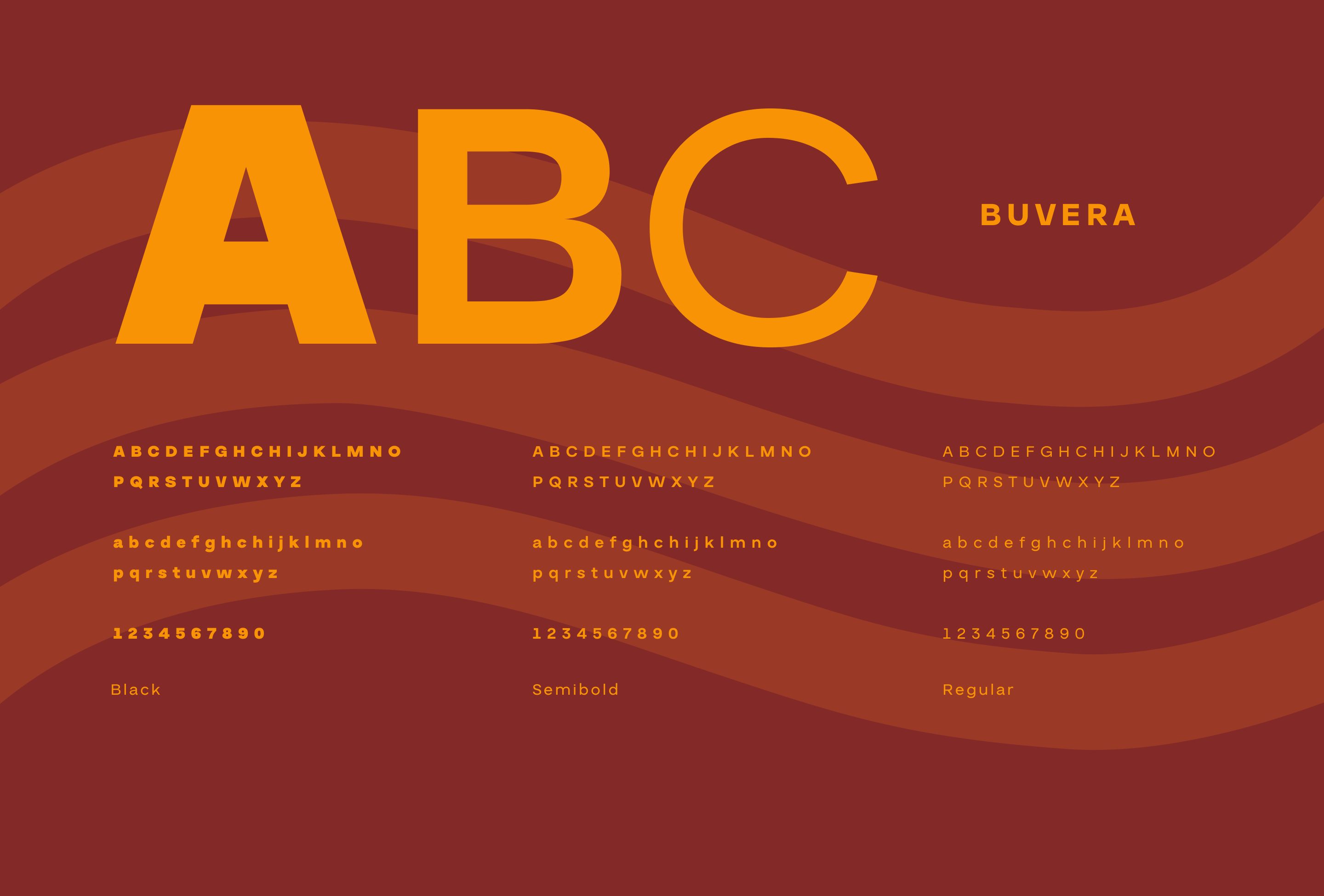
As the main typeface, we chose Buvera by Yukita Creative. It is modern, friendly and pairs beautifully with the bold colours of the whole identity. Thanks to its clean shapes and good legibility, it helps the brand look fresh, contemporary and consistent across all outputs.
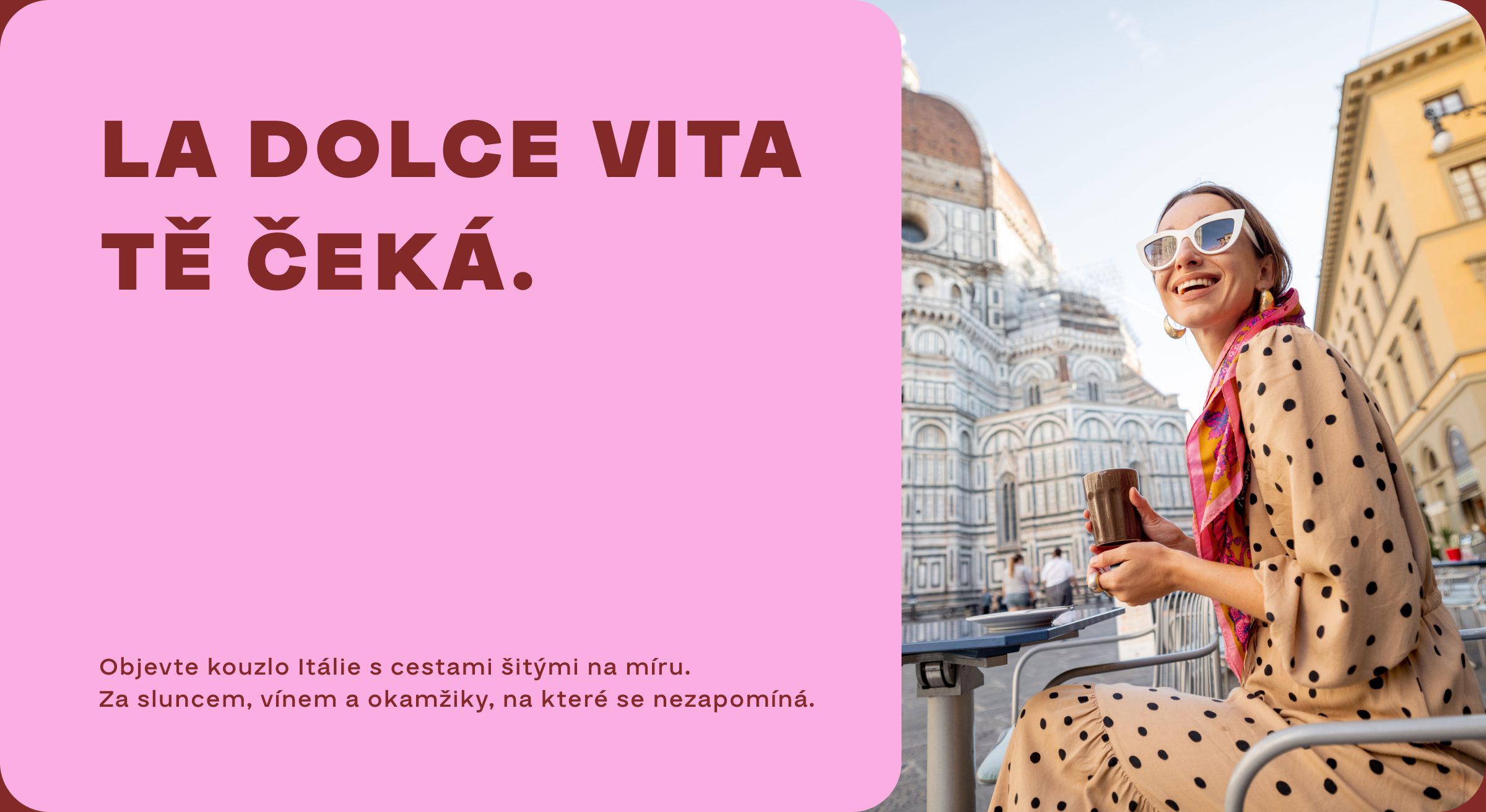
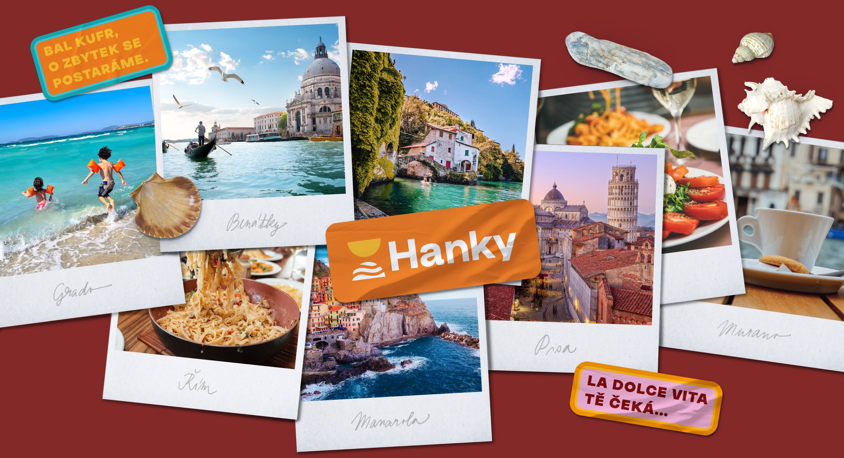
We chose a rich, joyful colour palette that captures the atmosphere of the Mediterranean – sun, sea and the carefree spirit of summer travel. The colours give the brand energy, optimism and positive emotions.
The bold colours are also a deliberate strategic decision. In the travel agency sector, often dominated by conservative shades of blue and predictable visuals, the brand comes across as confident, memorable and easy to recognise. The colour palette thus becomes one of the key elements that set the brand apart from the competition and reinforce its unique character.
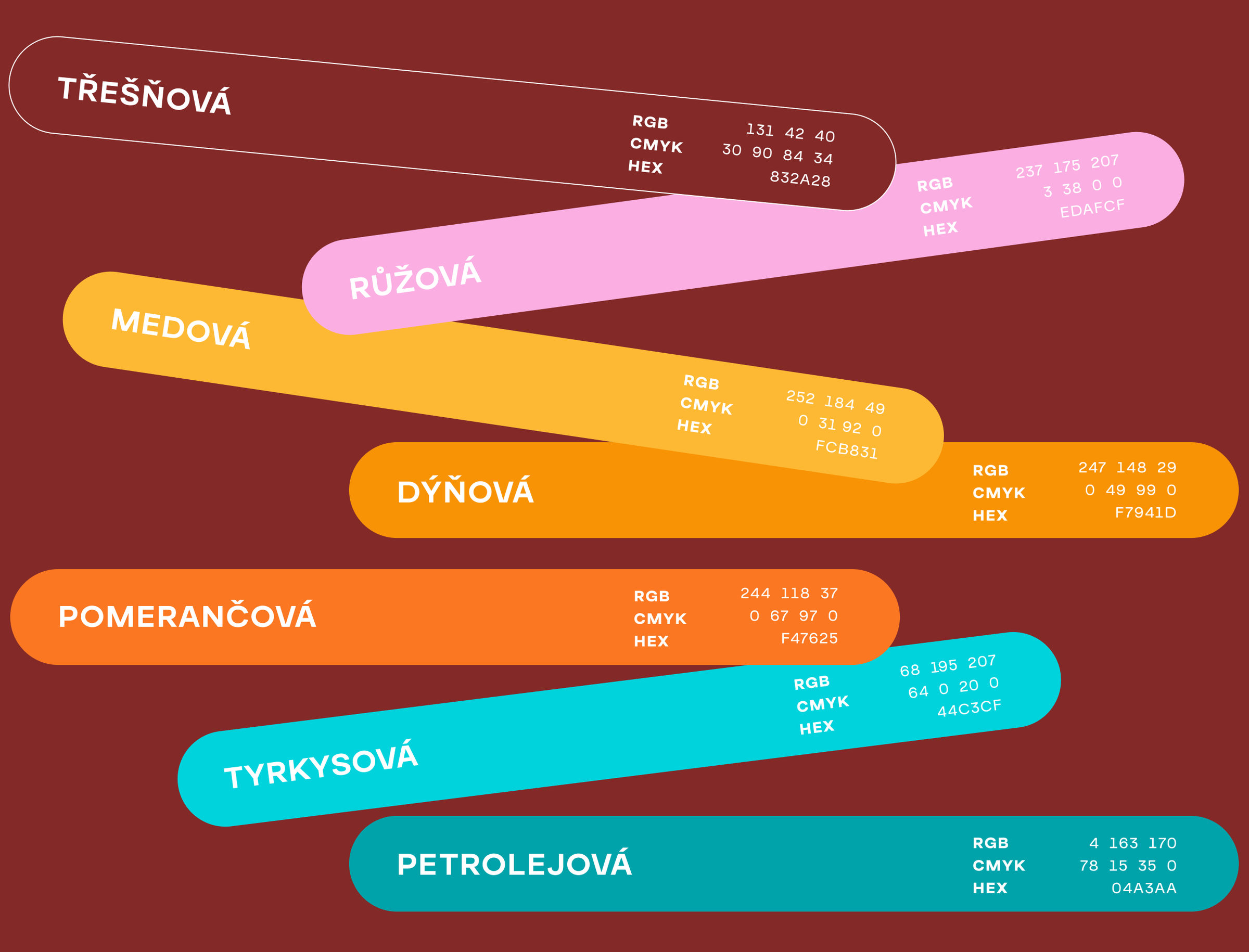
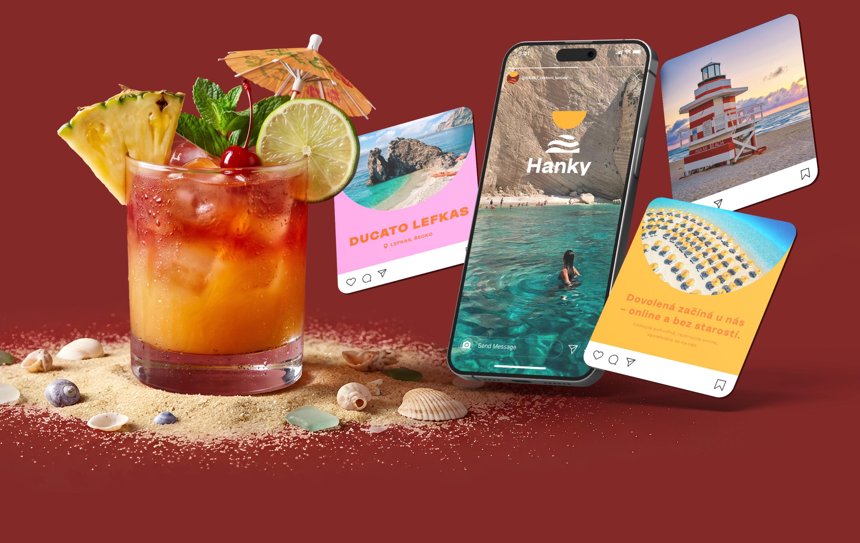
Vibrant colours combined with a bold typeface form the core character of the visual identity. These elements are so distinctive that they can represent the brand on their own, creating an easily recognisable visual style that can be used consistently across all communication materials.
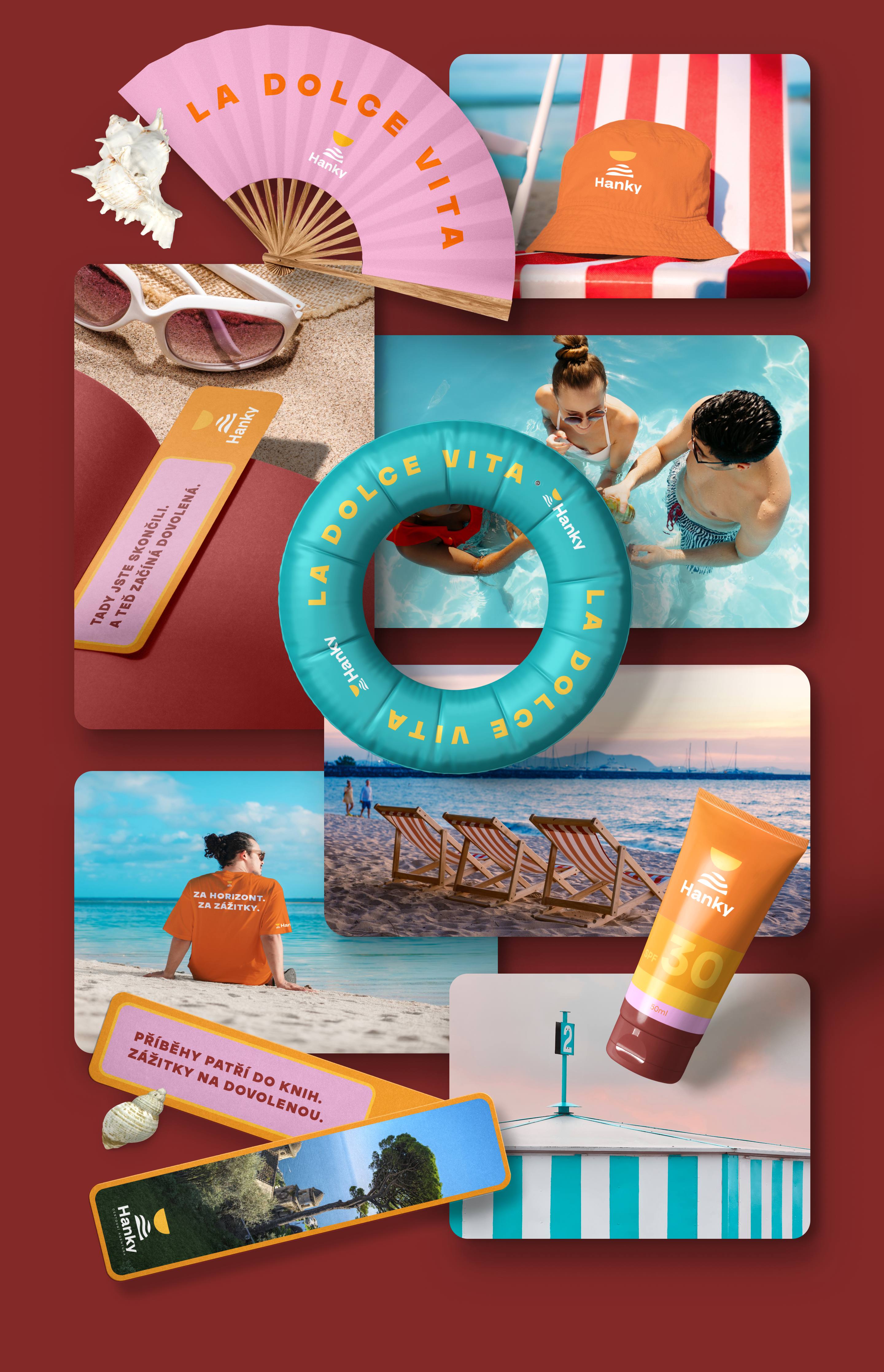
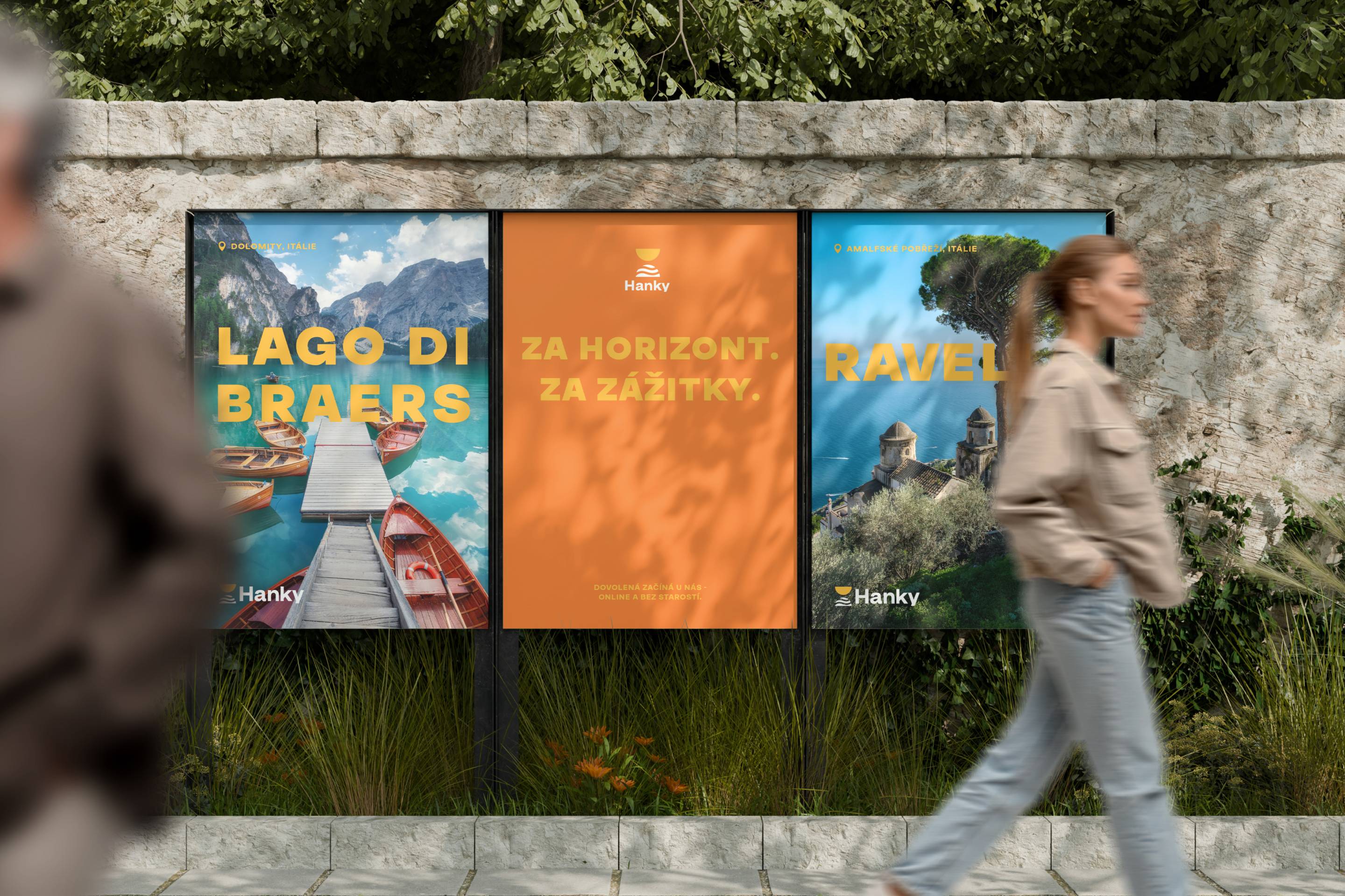
We really enjoyed searching for a simple solution that captures the character of the brand. We believe we have created a design that combines functionality with a clear visual idea and can serve as a solid foundation for the further development of the travel agency’s identity.
