

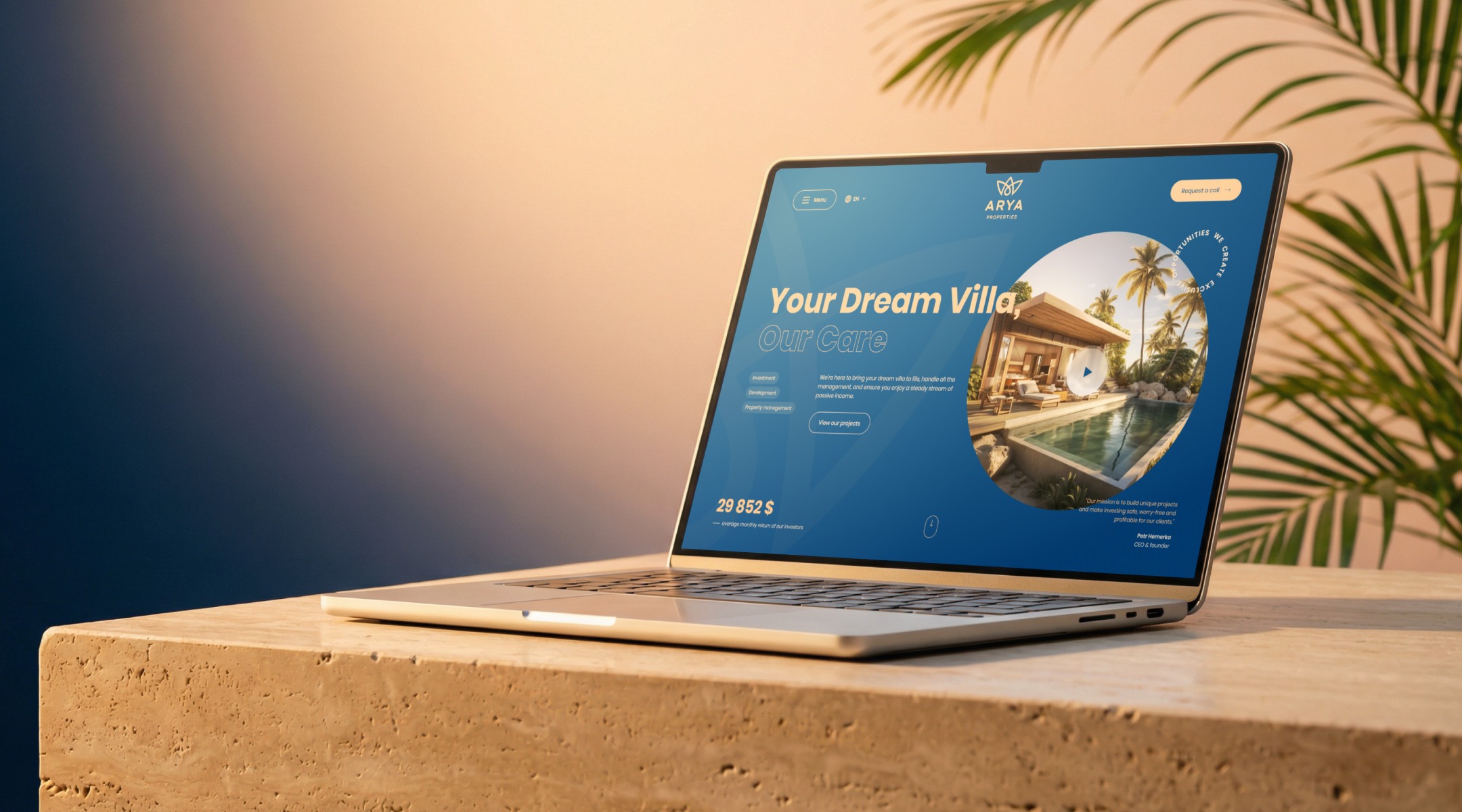
When ARYA approached us with a new plan, we knew something big was coming. A client we had once built an online store for had become an international developer of luxury resorts in Indonesia. We created a visual identity and a website for them that now sells villas, attracts investors and welcomes future guests — from the other side of the world.
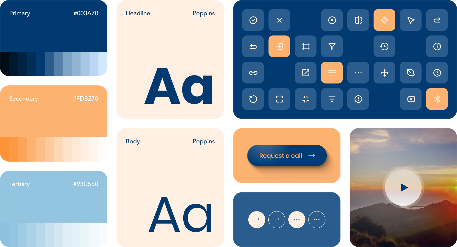
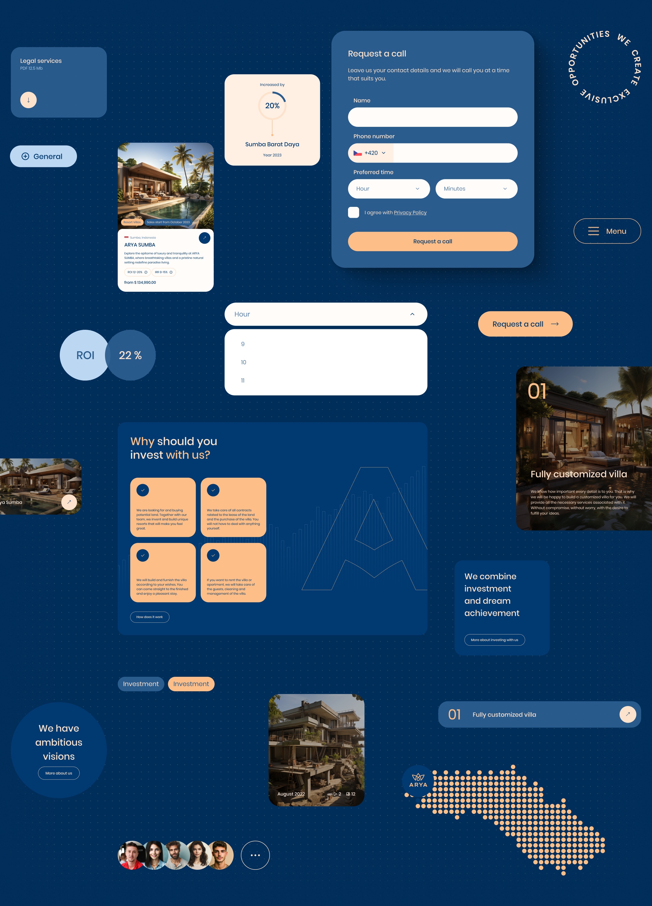
Before we started drawing individual pages, we gave the brand a solid foundation. Navy as the brand's anchor, a warm peach for moments when we want to grab attention, and light blue for a sense of airiness. Add Poppins — a typeface with character but without unnecessary shouting. And a set of components, icons and buttons that holds everything else together. The result isn't just a mood board, but a working system from which ARYA now builds page after page without having to rethink what a button or heading should look like.
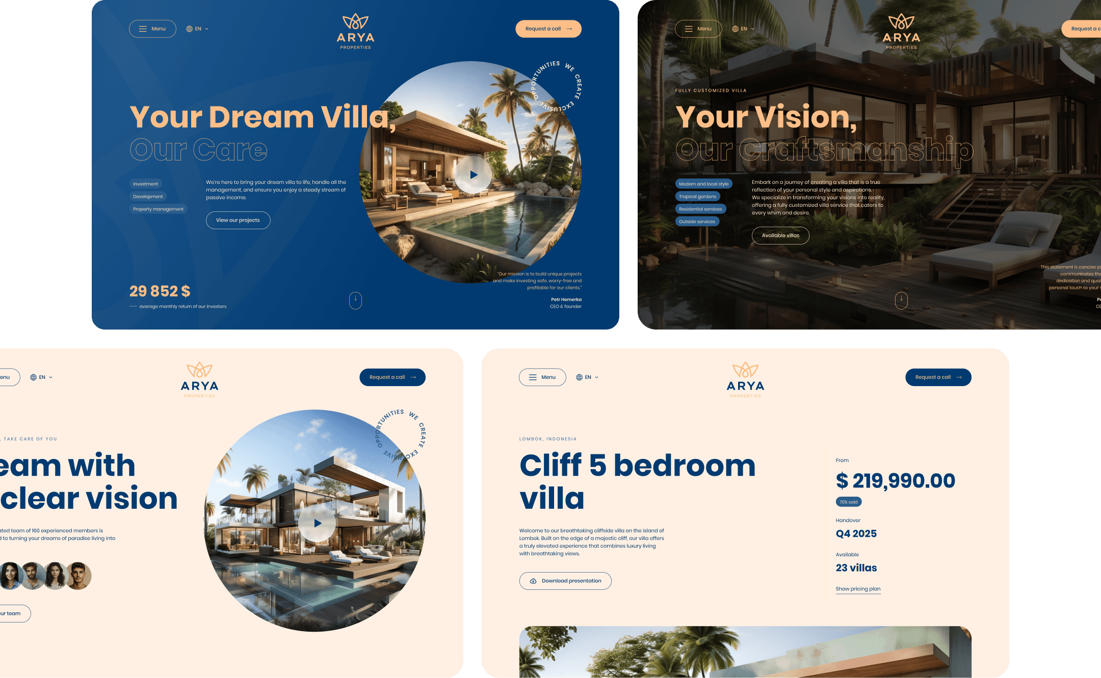
One visitor lands on the homepage, another on the detail page of a specific villa. One wants to be wowed by the atmosphere; the other already knows what they're looking for and needs to find the price and availability fast. That's why every subpage on the ARYA website has its own face. Some welcome visitors with sweeping views and strong emotion, others get straight to the point.
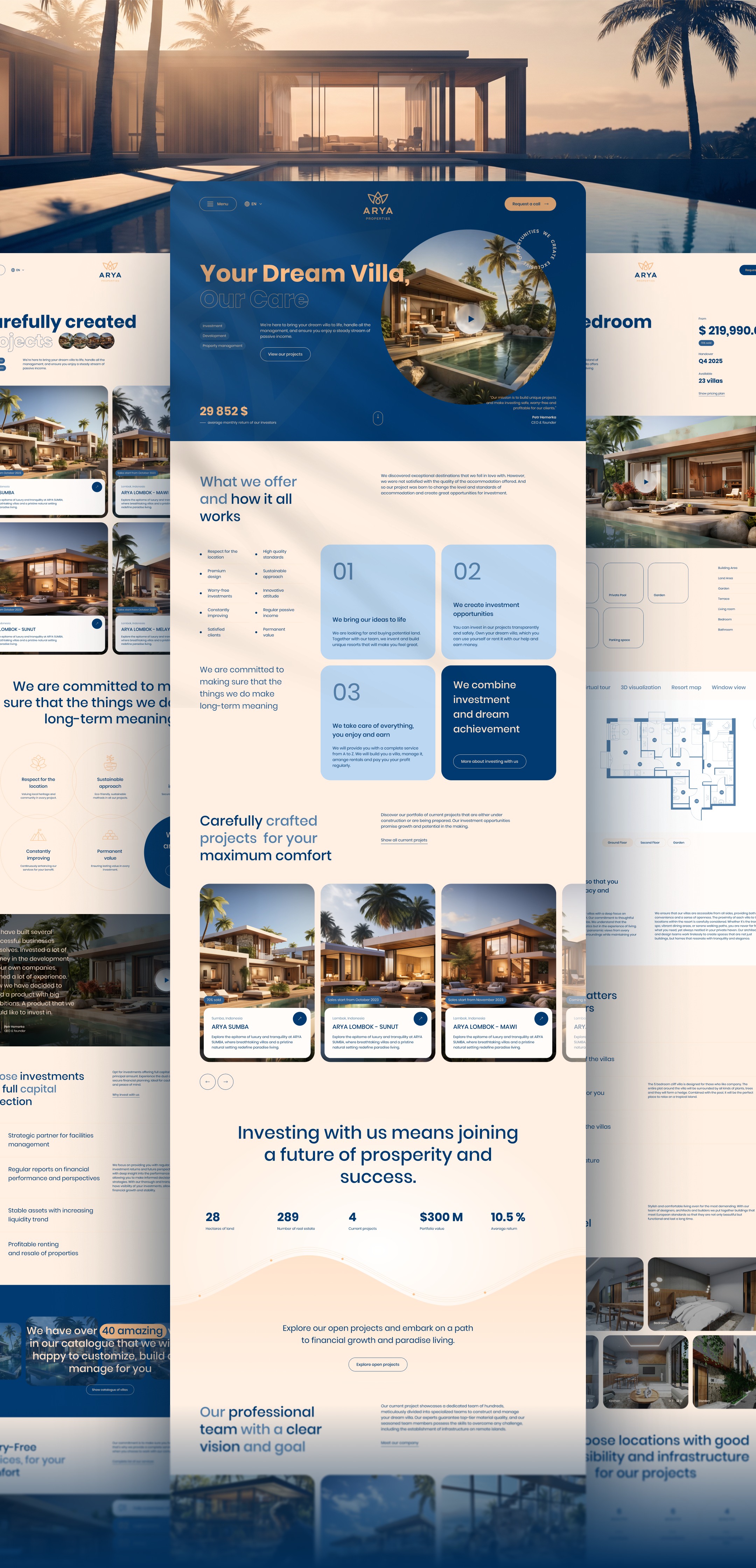
Add up all the key pages, subpages and their responsive variants, and you get over a hundred templates. Each key page is a complex landing page in its own right — long, rich in content and packed with different types of information.
Forms, badges, cards, buttons, maps, icons. We designed every component with a specific job and well-thought-out behaviour. Yet they all speak the same brand language — which is why you never get lost on the website. It's exactly the kind of subtle consistency users usually don't notice — but which makes a website feel “finished”. Without it, a page falls apart, however good the content.
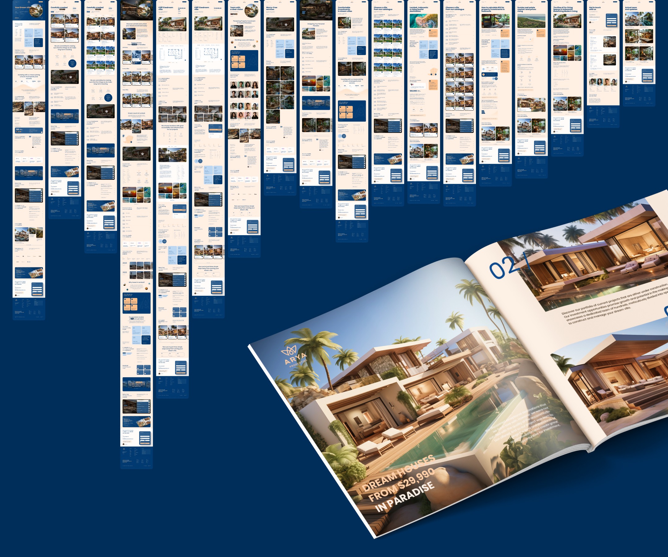
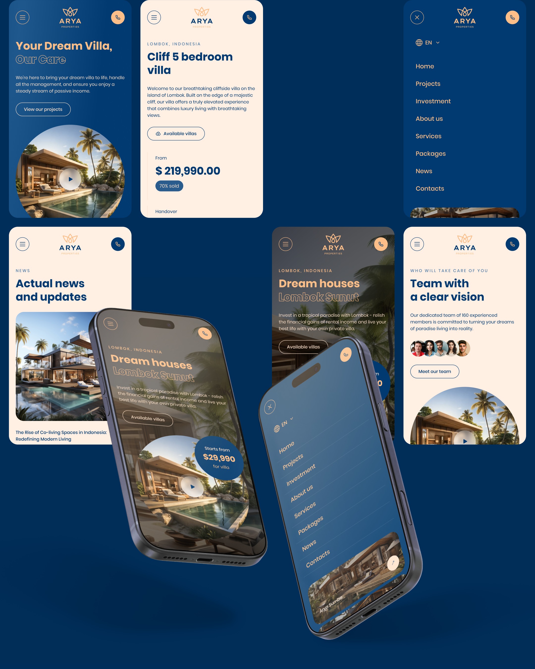
On mobile, visitors are usually exploring. On a tablet, they're often deciding. On desktop, they buy. The behaviour differs — and the website has to respond to it. That's why we designed all the key layouts for ARYA separately: mobile, tablet portrait, tablet landscape and desktop. Each device got its own attention; nowhere was it a matter of mechanically narrowing columns.
ARYA gave us trust, space and ambition — and we're grateful for it. A project that was created without real content, at a time when building permits were still being finalised, now helps the company sell luxury villas in Indonesia to clients from all over the world.
